Introduction to A2 Coursework

My name is Amber Mota, candidate number 9114, and for my A2 Coursework I am in Group 1. I am working along side Shayam Utting (candidate number: 9164) and Alistair Price (candidate number: 9137) to create a music video. The links to my work are on the right-hand side and are entitled: A2 Research and Planning, A2 Construction and A2 Evaluation.


'Trip Switch' By Come What May


'Trip Switch' By Come What May

Front Digipak

Front Digipak
Front Digipak

Inside Digipak

Inside Digipak
Inside Digipak

Our Website - Please click the image to enter site

Sunday 31 January 2016

Evaluation Q1: In what ways does your media product use, develop or challenge forms and conventions of real media products?

Throughout the production of the three media products, we have conformed to as well as challenged a large number of conventions. Due to the new and alternative nature of our band, we have broken quite a few forms in order to regenerate the content and spark interest and curiosity. However, we also used a lot of essential conventions to avoid the alienation of audiences, as a result of a completely unrelatable or un-palatable product.

Music Video

1) Performance, Concept and Narrative - Simon Frith

I have created this stop motion video to explain categorization process for music videos that was devised by Frith.


I have created a video denoting the ways in which this theory can be applied to 'Arcade Fire's' music video for 'The Suburbs'. Please write a name in the box, any name will do, then click continue in order to watch the video.


As can be seen from my commentary throughout this video, 'The Suburbs' has a very significant narrative drive. Having said this, particularly in the second half of the video, the concept was notably developed. This expansion of ideas enabled a powerful yet smooth progression that appears to add layers and dynamic to the music video. Overall, this is a very conventional example of a primarily narrative video that uses a concept as a supporting theme and it's structure has clear relation to the theory of Concept, Narrative and Performance.

The music video for 'Love Me' by 'The 1975' also uses Simon Frith's theory, however in a completely different manor.


My Video:


My video conforms to this theory and uses a mixture of the Performance and Concept sections. It has two very distinctive set-ups, each with a very clear purpose.


Performance:

Roughly half of our video is performance based. The primary aim of the band scene on roof is to expose the talent and familiarize audiences with the band members, without producing an over complex concept or narrative video.

This performance set-up almost completely conformed to convention. This is because we felt the rooftop setting would provide the alternative edge we were looking for, thus there was no need to take risky decisions that could lead to a significant loss of target audience interest. Furthermore, in order for audiences to connect with the performance based aspect of the music video, the use of lip-sync, dancing, instrumental close-ups and dynamic shots were essential.

Concept:

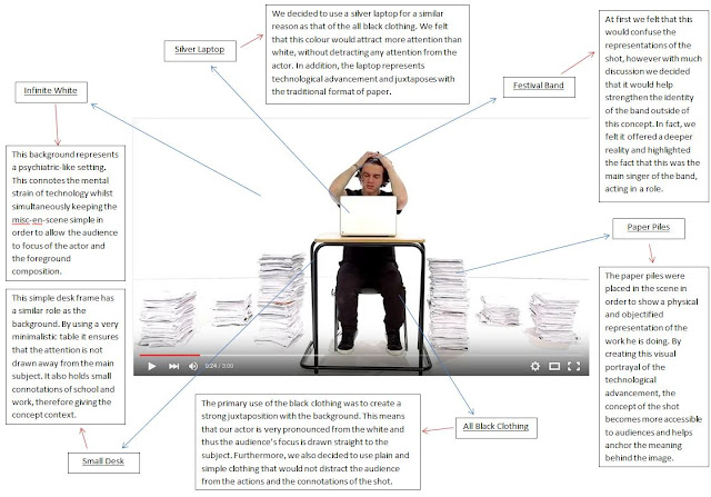
In addition to the performance, we also depicted a progressive concept. As can be seen from the annotated image below, every aspect of the misc-en-scene has been carefully constructed through semiotics in order to produce a consistent and coherent conceptual message.


2) The Semantic Code, The Symbolic Code and The Cultural Code - Roland Barthes

The Semantic Code: This points out to any section in the lyrics that suggests a particular meaning by a connotation which the story suggests.

The Symbolic Code: It is fairly similar to the Semantic Code, however it acts at a wider level, as it organizes semantic meaning into a broader and deeper set of meanings. This is often done in the use of contrast, where new meanings arises out of opposing and conflicting idea.

The Cultural Code: It looks at the audiences wider cultural knowledge, morality and ideology. This relates to the audience and makes the video more interesting and realistic.


3) Lyrics, Music and Visuals Triangle and The Relation of Visuals - Andrew Goodwin

Lyrics, Music and Visuals Triangle:


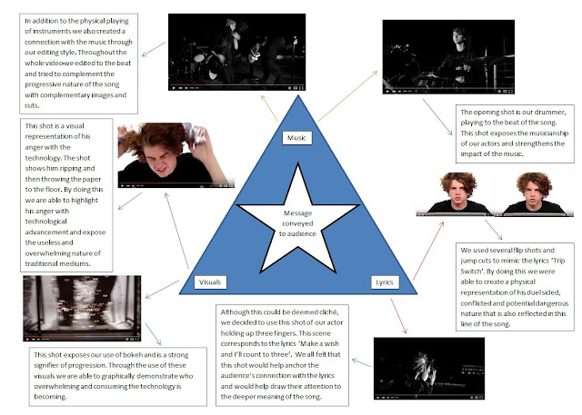
This Goodwin Theory was key to my understanding of the the relationship between lyrics, music and visuals. For example, the music video for 'Fear and Delight' by 'The Correspondents' is very visuals heavy and the whole contraction is focus around the technical possibilities when using a 360 degree infinite white studio space. Having said this, the lyrics and music are not rejected nor neglected, instead they are captured and connoted through subtler techniques, allowing the stunning visuals to take centre stage without detracting substance from the video.

In my video we have managed to create a seemingly even balance between all three aspects. This is because we used the different scenes for different purposes and employed different mechanisms to ensure each was carried out successfully.


The Relation Of Visuals:

Illustrate: When the music video uses a set of images to illustrate the meaning of the lyrics and the genre
Amplify: This is where thing are constantly shown. Such as the meaning and effects are manipulated.
Disjuncture: This is where the meaning of the song is completely ignored.


Our music video primarily uses amplification, however it occasionally relies on illustration as well. The main reason for our decision to amplify the meaning of the song was due to the ambiguity of its imagery.

We felt that this allowed us creative control to construct a concept that was different to the perhaps more obvious meaning of love. As can be seen from these gifs, we have manufactured a more literally meaning, surrounding the nature of technology.

4) Editing Conventions

Music Video's are conventionally discontinuous and as Vernallis claims, they typically challenge the theory of continuity editing. He also added that the editing must reflect the cutting of the music and work with the style of the track.

We have adhered to this form and therefore have attempted to display a strong sense of progression throughout the performance, in order to mimic the progressive nature of the song. This diagram visually explains the nature of the dynamic development that unfolds throughout the song and video.


There are also a large number of real music videos that conform in a similar manor, one example being 'It's Oh So Quiet' by Bjork.This music video has been constructed by Jonze to highlight the huge changes in dynamics of the song by switching between slow motion movements and elaborate enthusiastic dance scenes.

5) Conventions Of The Genre

As well as music video conventions, there are also a wide range of genre forms that we have both developed.
Artist: We tried to draw on ideas and classic frameworks of artist idea and try to progress them further. We tried to connote ideas of gender equality as we felt that this a very relevant topic at the moment and something that everyday audiences would like to see being embodied.

Themes: Although it could be argued that the theme of our music video was only a literal interpretation of the lyrics, we felt that it would be conventional of the alternative rock genre. This is because it is very common for rock music videos to pose social commentary and the style of music has historically been recognized as the "sound of the rebels". In addition, the alt. genre is famed for posing a slightly unusual and potentially controversial perception of the every day, hence the name "alternative".

Album Cover


1) Conventions of an Album Cover

We were very keen to produce a very professional album cover than contain a large number of conventions. As a result we conducted extensive research in order to ensure our execution of the production would be accurate.

This diagram exposes the influence of real media texts on our project and also highlights where we decided to adhere to or challenge convention.


3) Synergy

After extensive research it became apparent that albums work in symbiosis with the website, particularly with debut albums. The way in which this synergy is normally manufactured if through a clear establishment of various visual motifs.

Catfish and the Bottlemen are just one example of this being used in practice and as can be seen from the diagram below it has worked very effectively.


Looking at this synergistic relationship reinforced the importance of consistent motifs and a coherent brand identity, that must be carried across both platforms in order to ensure success.

In reference to this I have created this detailed breakdown of our visual motifs and how they have been established on both platforms.

Website

1) Conventions of websites

Like the album cover, we were also keen to produce a professional and stylized website, this therefore meant a knowledge and judgement of website conventions was crucial. As a result, I have created this diagram in order to clearly denote the conventions that we challenged or followed.


2) Interactivity

Due to the proliferation of the web, interactive media has become a key aspect of the online media world; particularly in marketing. This fairly modern convention was very significant to our production and we felt that using it would be crucial to the targeting of our audience.

As a result of this theoretical understanding we decided to apply it practically. We therefore introduced a variety of different interactivity tools, as highlighted in the video to the left.


3) Social Media

Similarly, the possibility of technological convergence within web 2.0 has resulted in the creation of another website convention. This means that it is now typical to utilize a wide range of social media platforms in order to further strengthen the brand identity. Furthermore, in recent years convergence has been developed which now allows live streams to be embed and therefore enables a more dynamic web surfing experience.

Here is how we incorporated this convention in comparison to other artists:


3) Purchasing Opportunities


Finally, when think about the overall purpose of an artists website, we realized that selling the band and their music was the key use. Therefore, we understood that clearly displaying purchasing opportunities would be essential to the success of our site. Consequently, we created a page called 'store' that could be accessed through the main navigation banner. This is extremely conventional, and as can be seen from the images below, it is a very common way of advertising the music as well as all merchandise.


Overall, I think that my three media texts have attempted to develop convention. We have been careful to ensure that we have a sound knowledge convention and only after that have we attempted to push boundaries or challenge convention in certain ways.

Saturday 30 January 2016

Evaluation Q2: How effective is the combination of your main product and ancillary texts?

In order to create a strong identity for our band it was necessary to create a cohesive and dynamic marketing campaign that worked effectively in combination. To do so, we have practically applied wide range of media theories and principles in order to construct 3 products that work in symbiosis.

Brand Identity

Firstly, we wanted to ensure our brand identity, was realistic, interesting and easily expressible through our music video and the ancillary texts.

Naturally, when deciding upon the key representations of our band, we looked to previous similar artists for inspiration. Although I initially felt this was un-original and un-inventive, after having read
Fuchs' (2010) essay on critical theory in the media, I came to understand that "integration and unification does not mean that difference is abolished at the expense of identity."It rather means that "old elements are preserved and elevated to a new level."

In terms of artist identity, I feel this means that new musicians will always have influences and inspirations and this will be reflected in their image. This suggest that nothing completely new is produced and instead, modern day artists are just a regenerated and modified versions of the same thing.


Having drawn to this conclusion, we used this theory and a wide range of references to strengthen the representations and connotations of our band.


We also created this word compilation diagram that highlights the key elements of our band's identity and their primary selling points. We have referenced Dyer's Star Theory to ensure that we depict "an image (not real people) that are constructed out of a range of materials, concepts and beliefs."


We then had to think beyond just deciding upon the representations and plan how we would be able to connote these denotations to the audience. Below, I have created a detailed case study of Arctic Monkeys and their methods for the creation of their identity.


Much like Arctic Monkeys, we used a multi platform marketing campaign to heighten the anticipation around the release of the new album. Furthermore, we also took a lot of inspiration from their powerful album cover that contained a wealth of strong semiotics.

However, Arctic Monkeys are a very well known and established band, meaning that their influence on my project was limited. Therefore, I have also created this Prezi below that outlines the marketing and branding of 'Catfish And The Bottlemen' and their debut album 'The Balcony'.


Despite the limits of the school-based project, we have tried to compose a detailed and cohesive marketing campaign that utilizes the ancillary texts in order to strengthen the brand identity connoted in the music video. In addition, through the use of minor detailing and extra social mediums we have managed to create a cross-platform accessible campaign that would be effective for introducing 'Come What May' into the current music industry.

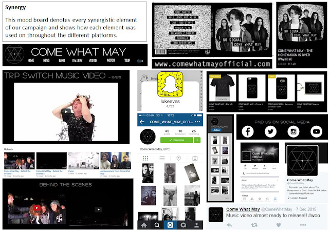
Here is a detailed mood board of the constant synergy between platforms:


Overall,  I think that my 3 products work very successful and symbiotically. In addition, due to the engaging and extensive nature of the campaign, we have been able to solidify our brand identity and consistently present that to our audience. Furthermore, through the constant release of new content that links to the texts, we are able to create awareness surrounding our band and then interest, anticipation and desire for the album, through the publishing of the music video and album cover on the website.

Thursday 28 January 2016

Evaluation Q3: What have you learned from you audience feedback?

In order to receive relevant and valuable feedback we felt that the people in question must be within the target audience of our artist. Therefore, it was necessary to have a clear and detailed outline of typical audience members.

We planned for our core audience to be between 16 and 24 and to be fans of the genre. We also though our product would appeal to both males and females and would attract fans of both the indie/alt. and rock genres.

Throughout the entirety of this project we have collected a huge amount of primary and secondary audience feedback. In addition, we have also reached out for the opinion of discerning music fans, in order to enhance the likelihood of expanding the TA. Overall, the constant audience feedback has been crucial to the development and progression of my video and I can confidently say that it has been extremely beneficial to our attention to detail.

Brand Identity

During the process of establish our brand identity we decided to get a lot of audience feedback in order to create a relatable and interesting band that will be able to gratify our TA's need for personal identity and diversion.

Before starting the planning process I decided to interview fans of the genre and ask them about the key things they looked for in artists. I learnt that the identity of the artist holds as much impact as the sound they are producing. In addition to this, their comments caused me to start thinking in more detail about the band's outlook on the world and their passion for music.


Construction

During the construction period, we were constantly referencing audiences opinions and tried to make adjustments where practical.

Music Video:

When producing our music video we were constantly asking both primary and secondary audience members about our decisions. We did multiple focus group questioning sessions as well as distributing questionnaires in order to gauge opinion.

We also ask members of the target audience to answer to fill out a range of questionnaires, the document below is just one example:

Album Cover:

Throughout the construction of our album cover we were constantly using audience feedback in order to develop and improve our ideas as well as helping with key artistic decisions. This questionnaire is just one of the many we produced to try and gather some audience opinions, in order to steer the development of our product.


Website:

Before starting the actual construction of our website, I decided that it would be a good idea to create several computer generated templates of a selection of different pages. This then allowed myself and Shayam to do one-on-one interviews with our target audience and see how they reacted to the layout of the site.


Overall, their response was very positive and 85% of all people asked identified the genre as rock, with the other 15% saying indie or punk. This statistic showed us that we were portraying the band's genre, and therefore their identity, very effectively.


Having said that, there was a small number of more negative comments that were regularly repeated:

1) They felt the font was too small and not bold enough which meant it lost impact and therefore lost the audiences attention more easily.

2) A few people that I interviewed said that they felt there was a lack of identification of the band and mentioned that the site would be improved if the band we shown on the homepage of the site.

3) Lastly, a lot of the people interviewed were unsure the complete black and white theme and suggested an input of color. However, this opinion was not necessarily negative, instead it was just a common question raised.

Overall, I was very happy with this feedback and I think it gave me a lot of valuable information to be able to improve my website. This audience feedback was crucial to the progression and development of our website as by raising these issues it allowed us to reflect our decisions and make adjustments accordingly.

Final Products

Once we felt that our products were close to being finished, we decided that it would be useful to do another round of audience feedback to make sure there were no significant issues with our products.

Music Video:

We used video interviews as a method to collect audience feedback for our music video. In hindsight, I think that conducting interviews was very beneficial as it allowed us to ask audience members a range of questions that were specifically related to their previous answers, in order to clearly identify the  areas that needed improvement.

This video highlights the key responses we received and underlines the overall positive consensus.


As can be seen from this video our feedback was primarily positive, but we also managed to create a lot of improvement from their minor constructive comments.

Album Cover:

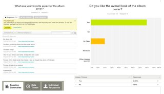
The album cover was arguably the source of the most constructive audience feedback. Through the site SurveyMonkey, we asked a wide range audience members, that may not have been accessible otherwise. We used a number of the website's questionnaire tools to create an effective and informative survey.


Website:

After the completion of our website I decided to get a large variety of people from our target audience to try out our site in order to see how they reacted to the navigation, styling and content.

This video is a compilation of a range of comments made by the interviewees :


 We found out, through these video feedback interviews, that audiences opinions on the website was almost completely positive.

The Collective Package

I was very keen to ensure that our main product worked in symbiosis with our ancillary texts in order to strengthen the synergy of the package. As a result, I also expected that this would aid the cohesion of our brand identity.

I decided that I would conduct several 1-to-1 interviews in order to find out whether or not we had effectively achieved this intended effect.

Here are a some key notes I made based on peoples responses:


Most Significant Improvements

1) The concept in the paper scene has not been as clearly connoted as possible. As a result, there is a sense of ambiguity surrounding the true meaning of the video.

2) Some of the audience felt that the synergy between the front and inside panels of the album cover is not strong enough. Consequently, my various digipak representations do not work in complete symbiosis and therefore, to discerning fans it could be perceived as unprofessional.

3) In hindsight, I would have liked to produced a wider range of web tools and widgets in order to create a much more well-rounded and interactive site

Most Important Successes

1) The majority of our target audience really understood the brand identity we were trying to portray and in general, I think that they really liked and related to these representations.

2) Everybody could see the cohesion between all three products as well as the active social media accounts. As a result, our overall looked quite realistic and sophisticated.

3) A lot of people commented on Luke's high quality acting and said that the casting was very clever.

Despite this detailed list of improvement, there are a lot of successful aspects of the project and overall, in hindsight, I am very pleased with the final outcome of my project.

Sunday 17 January 2016

Evaluation Q4: How did you use new media technologies in the construction, research, planning and evaluation stages?

Throughout the course of our project we used a wide range of new technologies to plan, construct and evaluated our project. We have used various different hardwares, softwares and web tools to benefit our project. Below I have created a detailed outline of the different technologies used for each stage of the project and have reflected on their purpose and effect.

Research and Planning:

This was the starting point of our project and immediately I noticed that taking full advantage of new technology was going to be crucial to ensure the success of my project.

Web 2.0

Web 2.0 describes World Wide Websites that emphasize user-generated content, usability and interoperability. We have used a wide range of web 2.0 tools throughout this project and have tried to incorporate this powerful and useful medium wherever possible. The reason it's so effective is primarily due to its proliferation, particularly in recent years, which has allowed mass-communication and therefore opened up the potential for mass-advertissement.


Youtube:


Youtube was our most used piece of Web 2.0 technology and it served multiple purposes throughout research and planning. We used the site to create inspiration lists and we uploaded our various different planning videos such as an animatic and a steal-o-matic. Overall, it is a very  efficient mechanism for doing research as it allows you to watch and bookmark almost any video.

Facebook:

Facebook and Facebook Messenger were also very important technologies throughout research and planning process. We used the messaging capabilities as our primary means of communication within our group but also to our actors.

This constant effort to communicate was crucial to the development our project and this method allowed us to update the group on our individual research very regular. Furthermore, the cross-media converged nature of the site means we were able to send images, gifs, videos and even documents.


We frequently used the chat to update group members on plan adjustment and the progression of any particular element of the project. Overall, it was a great tool to use for ensuring organization and thus the smooth-running of our project. The instantaneous nature of the messaging service also played greatly to our advantage.


Mobile Phones

In addition to our Facebook chat, we also used our phones for a large amount of our communication. Our access to technologically converged and integrated smart phone devices meant that we were able to take full advantage of their portability and instant connection.

I found this technology very important when out on shoots, recces and at school and it mean that every member of the group were constantly aware of the progress in the project and avoid anyone being late, lost or unprepared.

Construction: Production:

Canon 5D

This was the camera that we shot the majority of our footage with. Our rushes were shot in 1080p HD which resulted in a lot of aesthetically pleasing and high-quality shots. The high quality lens also meant that we could manually focus our shots. This was massively beneficial when filming dynamic shots as it avoided the second of blur before the focus is automatically re-adjusted. Overall, this camera was essential to creating a high quality video and the various different white balancing and aperture changing techniques allowed us to create well color-balanced 
interesting shots with a large depth of field.

Lighting Desk

Another key technological feature of construction was our use of The Leapfrog Lighting Desk. As can be seen from the photo on the left, this professional desk controlled over 20 1000K Arri Lights, that could all be controlled independently of one another. In addition, it was also possible to add color filters, change the intensity and angle of the lights as well as the potential to save pre-programmed lighting set-ups. Overall, the lighting rig technology was very useful and despite my initial unfamiliarity
                                                                                    with the hardware, I soon felt confident using it
                                                                                    independently.

Floor Lamps

In conjunction with the lighting rig, we also used Arri Floor Lamps. Despite their weight, these lights are reasonably portable and are very versatile. We used these lights in both the studio and rooftop scenes and overall they work very efficiently with only 1 blown bulb across the whole of construction. Overall, these lamps produced very professional lighting coverage and we were able to flood a rooftop at night with ease. The only drawback is that the lights get very hot and therefore pose a health and safety risk if not treated properly.


Construction: Post-Production:

I have created a Prezi that outlines all the media technologies used throughout the post-production stage of our project.


Evaluation:

Like the rest of my project, I used a large variety of new media technology throughout the course of my evaluation, the majority of which were online.

Web 2.0
Once again I used a wide range of online interactive technologies through Web 2.0. The non-linear capabilities means that I was able to constantly update, expand and improve my work.

Blogger:


This has been the most important piece of technology for my evaluation as it has allowed me to publicly publish the development and reflections on my project. Blogger has been imperative to the development of my thought process as it has allowed me to display my work using this cross-media converged blog. Overall, the site is extremely beneficial as it has allowed me to create a dynamic page using a wide range of multi-media tools, instead of the linear format just text and images. On the other hand, I have found that blogger can be quite difficult to format and there are limits to its interactability. Despite these issues, this technology has not really inhibited the quality of my evaluation.

Prezi:


Throughout my evaluation I have been able to embed various different Prezis into my blog posts. Furthermore, by technologically converging these softwares I have been able to create a interactive page that presents information in a much more palatable way than block text. I have tried to use this web tool wherever possible as I feel that it makes my work much more understandable and therefore more engaging. In addition, Prezi also supports other mediums, meaning you are able to add videos, gifs, pdfs and even voice-overs and thus one can create a completely integrated and 
interactive presentation.


Padlet Screenshot
Padlet:

This is another technologically integrated online software that I have used. It works symbiotically with Blogger and therefore is very effective when trying to graphically display ideas and theories.


Zaption:

Like Padlet, Zaption is another online software that allows you to produce a running commentary on videos quickly and easily. Despite its high quality product, it is quite difficult to format and doesn't convergence very easily with blogger.


Imgflip:

I have also used Imgflipm for my evaluation, in order to create large variety of gifs. This has been very beneficial as it has allowed me to create dynamic images that contain multiple frames and therefore allows more extensive evidence than a still image.


Survey Monkey

Throughout the evaluation, we conducted a large number of surveys and for the majority of which, we used the online app 'Survey Monkey'. Through using this web-based surveying site we have been able to create and distribute questionnaires in order to gauge the public's view. Overall, This site has been incredible useful and effective and the versatile and adaptive format has really allowed me to utilise the programme extensively. 

Monday 21 December 2015

Construction Post 6: Website post-production

As we have finished our music video, we have decided to focus all of our attention on the digipak album cover and website. For this, we will use Wix.com; a cloud-based web development platform that allows users to create HTML5 websites.

Due to the fact that we are still working on the album cover, we have decided to split up the roles slightly differently. Alistair will be in charge of the technical and navigational aspects, Shayam will focus predominately on the content and I will concentrate on the visual aesthetic. Having said this, we will not stick exclusively to our sections, we will just be managing particular sections to ensure the website is completed on time.

After having set up the site, we decided on our color scheme. We have chosen a plain black as our primary color and white for all text. Although there are many sites use white for the background color, we felt that our genre would be better connoted using the inverse. This was anchored by my previous research into other alt. rock websites such as 'Arctic Monkeys' and 'Catfish And The Bottlemen'.
'Catfish And The Bottlemen' Website Header
We have now chosen our formatting style, a classic banner across the top of each page that contains links to each of the main pages. The image below depicts our development of the banner thus far.


Inconsistent color scheme
Once we finished the first draft of the site, we had a group meeting in which we highlighted our concerns. This discussion was very productive and we each came up with a variety of different issues. Firstly, I was concerned that the headline font and the logo I had created were not bold enough. Shayam and myself also agreed that we should have a strong color scheme particularly for all the photos in the news column. The final key issue was the lack of interactive media for the fans across our site.

In response to these concerns, we have decided to increase the weight of both the headline and logo, we have made all of the news photos black and white and we have created a variety of different announcement videos; something that has been inspired by bands such as 'Amber Run' and 'The Neighbourhood'.
Consistent color scheme

Improved Header


We have now decided that audience feedback is needed. We decided that Shayam will gather feedback while I continued with the album cover.

Overall the feedback received have been very positive with only a few minor issues. We showed them the website and then asked them a series of questions. Firstly, when asked the genre, 90% defined them as a rock band and the other 10% as a punk band. I was extremely happy with these stats as it shows that our genre semiotics were clear and effective. Other repeated comments were that our "website is very visual and easy to navigated" and that "the logo is really cool". However, there was some criticism. A few audience members suggested that "there should be an enter site page" and that we "should include some kind of live image feed".

We have now created a black and white simplistic enter page (below on the left) and we have inserted a live link to our Instagram feed that will be on our homepage (right).


These two tools are very common conventions in the rock genre. The enter page immediately presents the brand to the audience, which immediately anchors the band's identity. The Instagram feed also helps to connect audiences and highlights the consistency and symbiosis across all of the different platforms.


We have now decided to add some more interactive tools:

1) An album release countdown (left).

2) A ticket purchasing form (right).

3) A newsletter sign-up form (below).


Overall, I have found this software quite straight forward and very effective. It has allowed us to create a very professional and fully functional site and the constant ability to edit and improve the site to maximize our use of audience feedback. I am very pleased with the outcome and I would definitely use this site again to make another website.