Locations:
1) Ela's House, Chingford
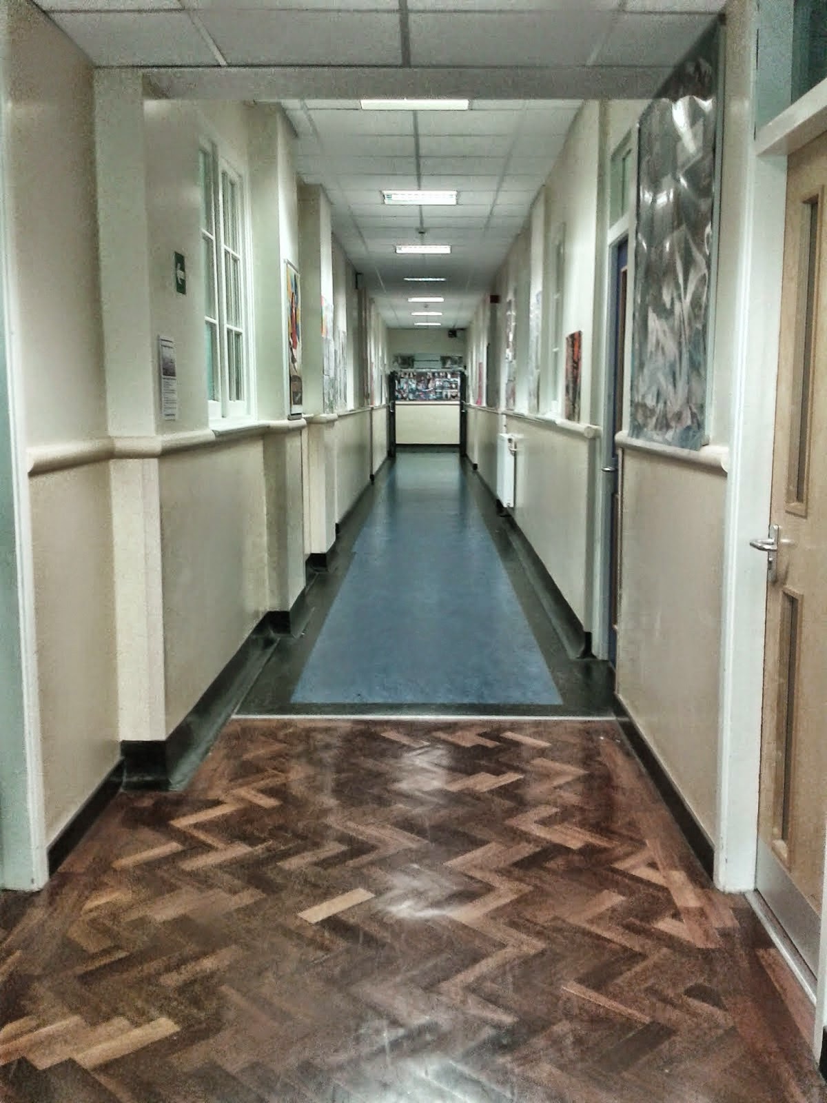
2) The Latymer School, Haselbury Road, Lower Edmonton, N9 (on the English Corridor).
 Both of our locations were chosen primarily on the environment they represented to the audience. For example, Location 2 (The Latymer School) was the obvious choice for us, due to the fact that it is easily accessible and has the correct connotations (of a sixth-form school). In addition, this choice meant that dressing the set was not an issue; as it was already exactly what we needed. Furthermore, the hallway is narrow and there are several classrooms off of it, which will make it appear packed (when all the characters are in it), whilst still giving us the freedom of space for the characters to gather in groups. Therefore, the set was perfect for the 40 second tracking sequence.
 Both of our locations were chosen primarily on the environment they represented to the audience. For example, Location 2 (The Latymer School) was the obvious choice for us, due to the fact that it is easily accessible and has the correct connotations (of a sixth-form school). In addition, this choice meant that dressing the set was not an issue; as it was already exactly what we needed. Furthermore, the hallway is narrow and there are several classrooms off of it, which will make it appear packed (when all the characters are in it), whilst still giving us the freedom of space for the characters to gather in groups. Therefore, the set was perfect for the 40 second tracking sequence.
The decision to use Ela's house was not as simple. This is because all three of us have rooms with girly connotations (which is not right for a teenage boys room). As a result, we decided to choose the room with the most neutral wall colour (white) and then dress the rest of the set with stereotypically masculine props, such as a basketball. Our decisions were inspired by Tony Stonem's bedroom in 'Skins UK'. This was because, although it was a boys room, the colours were all very neutral and plain, but through the use of props (e.g. dumbbells) it
 still had connotations of a teenage boys room.
When designing both sets we drew out a rough map of the spaces. This was in order to roughly determine what space will need to be cleared and redressed and the most effect way to do so.
 still had connotations of a teenage boys room.
When designing both sets we drew out a rough map of the spaces. This was in order to roughly determine what space will need to be cleared and redressed and the most effect way to do so.


No comments:
Post a Comment