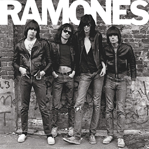
Secondly, I also noticed that the main convention of a debut album is that the band is normally depicted on the cover. The most important reason for this is to be able to sell the band as a brand and help the audience identify with the members.
These genre specific covers have inspired me immensely, but I felt that I needed to do some broader research in order to fully understand the conventions and techniques of a good cover. It was for this reason that I made a photo page of my favorite albums from across a range of different genres and eras.
 |
| My Photo Page |
1 - The Ramones - The Ramones
I love this album cover for its simplicity and the effectiveness of how it represents the band. Every little detail in this cover has been considered, even the order in which they are standing. I like how the cover clearly presents all of the band members and through the use of black and white, manages to create a strong brand and identity for the band.
2 - The White Stripes - Elephant
There are many reasons, for why I like this album cover and they are very different for the reasons I like The Ramones cover. Firstly, I find the magnitude of layers and the complexed nature very inspirational. I am interested in the way they have managed to develop the various different meanings of the image. The image initially seems fairly simple, but as you look closer you see the less obvious, but more impactful, representations. One example of this is the string attached to the women's foot. At first it is quite hard to notice, but this suggests strong connotations of being trapped or attached. This meaning is then made more significant when you see the skull just behind her. I really like this textured approach to a cover photo and I think the image coding is very unique. It is for these reason that I would like to adapt this approach for my album cover.
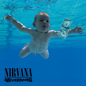
3 - Nirvana - Nevermind
Nevermind by Nirvana is arguably the most iconic album cover in the rock genre; for this reason I have decided to decode the connations and use it as inspiration for my own project. The use of a baby is juxtaposed by the greed for money that is suggested, and therefore eludes to a bigger issue in society. By targeting the natural instinct of humans to be greedy, the branding of the band is immediately strengthened and it is for this reason that the band are seen as counter-culture and anti-establishment. I am inspired by the power of this image and its ability to create a strong brand for the band, without using their faces, especially as this was their debut album.


No comments:
Post a Comment