Introduction to A2 Coursework

My name is Amber Mota, candidate number 9114, and for my A2 Coursework I am in Group 1. I am working along side Shayam Utting (candidate number: 9164) and Alistair Price (candidate number: 9137) to create a music video. The links to my work are on the right-hand side and are entitled: A2 Research and Planning, A2 Construction and A2 Evaluation.


'Trip Switch' By Come What May


'Trip Switch' By Come What May

Front Digipak

Front Digipak
Front Digipak

Inside Digipak

Inside Digipak
Inside Digipak

Our Website - Please click the image to enter site

Thursday, 15 October 2015

R&P Post 11: Artist websites that have inspired and influenced my ideas.

There were many websites that I found extremely valuable to look at, in order to get a strong idea of the conventions of a artist/ band website. There are a few I find particularly inspirational and below, I will explain the reasons for each one.


Firstly, the most impactful website to me was the 'Arctic Monkeys' page. This is primarily because of its clean and uncomplicated nature that is layered with a predominately black and white theme, in order to create a clear and concise webpage. In addition, I also really like the magnitude of videos and photos that are available to watch. This help sells the simplistic brand identity, as the saturated gallery helps share personality connotations; of friendship and funny moments, that are extremely relatable for the whole audience. Furthermore, all of the critical conventions of an artist website have been adhered to, resulting in easy navigation and a clear structure to the site. 


I also really liked the 'Nine Inch Nails' website for their low-key, gritty color scheme. I am inspired by the vertical layout for this page and its effective and easy navigation. Furthermore, it cleverly promotes the symbiotic relationship with the film 'Gone Girl' in order to boost sales for both parties.


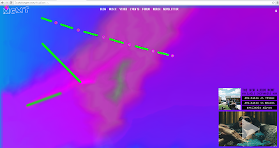
Despite my interest in these pages I also really like the 'MGMT' homepage. Unlike the first two, this page is bright and colorful and very interactive. It uses playful colors and only uses a small side panel for navigation, leaving the background images predominately exposed. I really enjoy this site as I feel that the interactive color background is very reflective of the light-hearted group vibes and the edgy, slightly vintage styling they like to promote

No comments:

Post a Comment