


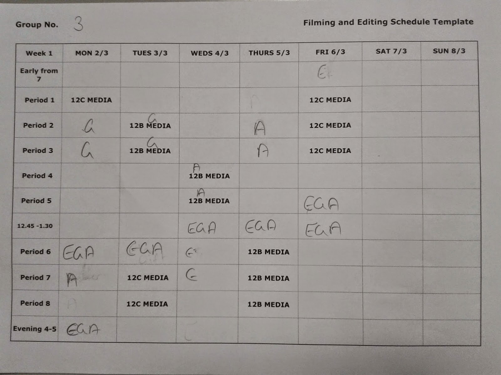
 At the beginning of edit week 2 we created another schedule. This was because we felt it worked very effectively in week 1 and the same level of organization and commitment was needed again.
We managed to have the cut finalized by the end of edit week 1, which meant that there were only 3 tasks left to complete in the second week. These were: 1)Grading 2)Soundscaping 3)Titles. So, we decided to have one of us in charge of each section. I was in charge of grading, Gift was responsible for the soundscape and Ela managed the titles. Whilst we all could still work on all the different sections, this prevented us from neglecting (and then rushing) any one of the sections.
Grading:
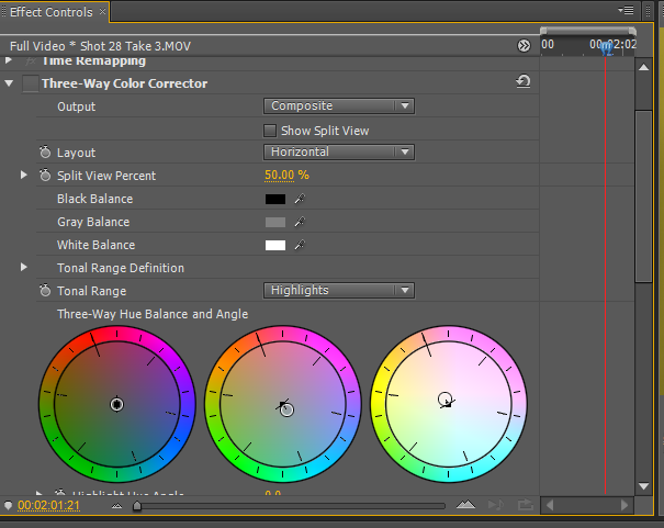 |
| The interface of the "Three Way Colour Corrector" |
In order to grade the different shots we use 2 main effect tools; "ProcAmp" and the "Three Way Colour Corrector". ;ProcAmp' enabled us to change the brightness, contrast and saturation of the shot, whilst the "Three Way Colour Corrector" could introduce or hide certain shades and color balances using 3 different color wheels.
 |
| A photo of Gift and I working on the grading |
Looking back, i think that the grading was the hardest part of these 3 steps. This was because each shot has to be edited individually and uniquely modified, yet they must all end up looking the same tone. In addition finding the initial toning that we wanted was also quite difficult, because it the saturation is too high everything has an unrealistic yellow glow that looks very fake, however the saturation and contrast is decreased the shot will lose all colour and could potential become surrealistic (not the right look for a teenage comedy). Furthermore i think that we should have spent more time on the grade in order to have a more professional and refined look to our opening.
Soundscaping:
In this week our main focus in the sound scape was the voiceover that is used when the mother is shouting for Arthur (the main character) to wake up. In order to make it sound realistic we had to make our voice actor stand far away and at an angle to the microphone. This is because if she spoke into the mic normally, when played alongside the footage, it would have sounded as though she was in the room and not next door.
Creating the titles:
Our chosen font is called Brain Flower and we discovered it on a software called "LiveType". The reason for our choice was because we liked its joyful, young and informal nature (without it being too comical and distasteful). We also thought that it highlighted connotations of the teen comedy genre; because of the similar typefaces used in other films from the same genre, for example in 'Juno'.
 |
| Our chosen font |
 |
| The "Juno" font |
Conclusion:
Overall, i think that we worked very well as a group this week and we all made a lot of effort to find time out of the school hours to do extra work on the project (working before and after school).
The only thing we could have done to improve was to have finished our voice over before this week to allow us more time on the harder processes; grading.
No comments:
Post a Comment